

AI文摘
此内容由AI根据文章内容自动生成,并已由人工审核
本文介绍了如何在WordPress文章中添加渐变背景样式,以美化段落并提升阅读体验。教程提供了四种不同的渐变背景效果示例,包括灰色、橙色、蓝粉和绿色渐变,分别适用于不同类型的内容。通过CSS代码实现这些样式,可以引导读者视线、强调重要内容,并创造愉悦的视觉体验。文章还展示了如何通过简单的代码修改来应用这些渐变效果,帮助用户轻松美化自己的WordPress文章。
<title>WordPress文章段落渐变背景样式教程</title>
<style>
* {
margin: 0;
padding: 0;
box-sizing: border-box;
font-family: 'Segoe UI', 'PingFang SC', 'Microsoft YaHei', sans-serif;
}
h1 {
font-size: 2.8rem;
margin-bottom: 15px;
background: linear-gradient(45deg, #6c5ce7, #fd79a8);
-webkit-background-clip: text;
background-clip: text;
color: transparent;
text-shadow: 2px 2px 8px rgba(0, 0, 0, 0.1);
}
.divider {
height: 3px;
background: linear-gradient(90deg, transparent, #6c5ce7, transparent);
margin: 30px 0;
border: none;
}
/* 内容区域 */
.content-section {
margin-bottom: 50px;
}
.section-title {
font-size: 1.8rem;
margin-bottom: 20px;
color: #6c5ce7;
display: flex;
align-items: center;
}
.section-title i {
margin-right: 10px;
background: linear-gradient(45deg, #6c5ce7, #fd79a8);
-webkit-background-clip: text;
background-clip: text;
color: transparent;
}
.section-content {
line-height: 1.8;
margin-bottom: 20px;
}
/* 渐变段落样式 */
.gradient-paragraph {
margin-bottom: 30px;
padding: 25px;
border-radius: 12px;
line-height: 1.8;
font-size: 1.6rem;
transition: all 0.3s ease;
box-shadow: 0 5px 15px rgba(0, 0, 0, 0.08);
}
.gradient-paragraph:hover {
transform: translateY(-5px);
box-shadow: 0 10px 25px rgba(0, 0, 0, 0.15);
}
/* 渐变样式 */
.gradient-1 {
background: linear-gradient(135deg, #a8edea 0%, #fed6e3 100%);
color: #4a4a4a;
border-left: 5px solid #6c5ce7;
}
.gradient-2 {
background: linear-gradient(135deg, #f5f7fa 0%, #c3cfe2 100%);
color: #4a4a4a;
border-left: 5px solid #4a69bd;
}
.gradient-3 {
background: linear-gradient(135deg, #ffecd2 0%, #fcb69f 100%);
color: #4a4a4a;
border-left: 5px solid #e17055;
}
.gradient-4 {
background: linear-gradient(135deg, #84fab0 0%, #8fd3f4 100%);
color: #4a4a4a;
border-left: 5px solid #00b894;
}
/* 提示框 */
.tip {
background: linear-gradient(135deg, #ffeaa7 0%, #fab1a0 100%);
padding: 20px;
border-radius: 10px;
margin: 30px 0;
border-left: 5px solid #e17055;
position: relative;
}
.tip::before {
content: '提示';
position: absolute;
top: -12px;
left: 20px;
background: #e17055;
color: white;
padding: 5px 15px;
border-radius: 20px;
font-size: 0.9rem;
font-weight: bold;
}
</style>
<h1>WordPress文章段落渐变背景样式教程</h1>
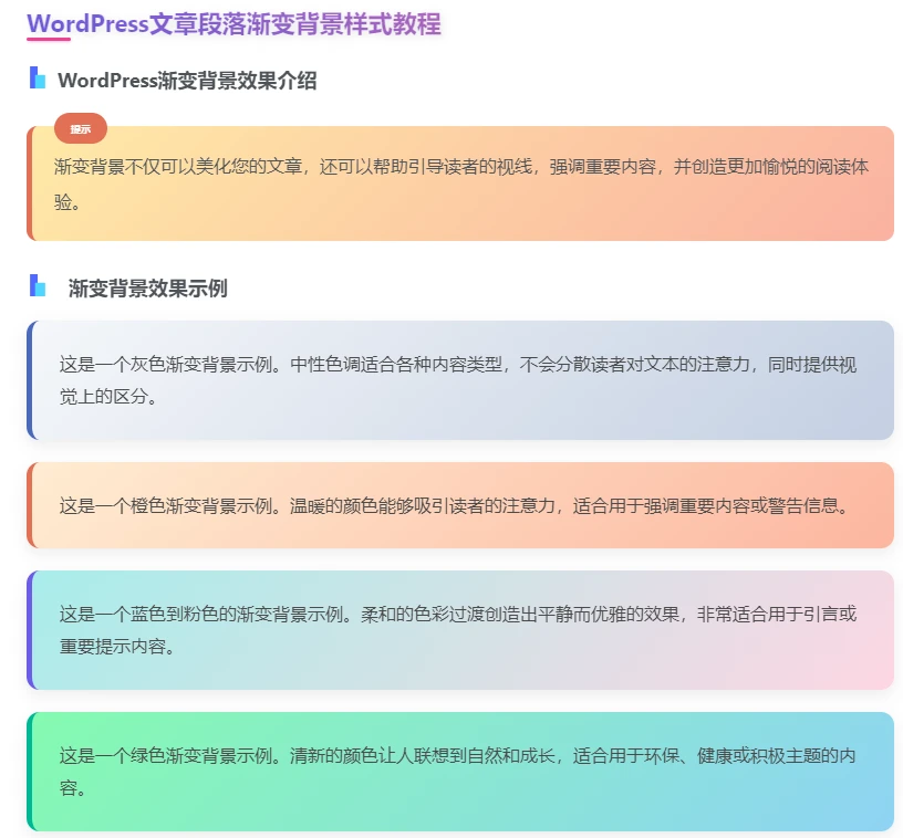
<h2 class="section-title">WordPress渐变背景效果介绍</h2>
<div class="tip">
渐变背景不仅可以美化您的文章,还可以帮助引导读者的视线,强调重要内容,并创造更加愉悦的阅读体验。
</div>
<h2 class="section-title"><i class="fas fa-palette"></i> 渐变背景效果示例</h2>
<p class="gradient-paragraph gradient-2">
这是一个灰色渐变背景示例。中性色调适合各种内容类型,不会分散读者对文本的注意力,同时提供视觉上的区分。
</p>
<p class="gradient-paragraph gradient-3">
这是一个橙色渐变背景示例。温暖的颜色能够吸引读者的注意力,适合用于强调重要内容或警告信息。
</p>
<p class="gradient-paragraph gradient-1">
这是一个蓝色到粉色的渐变背景示例。柔和的色彩过渡创造出平静而优雅的效果,非常适合用于引言或重要提示内容。
</p>
<p class="gradient-paragraph gradient-4">
这是一个绿色渐变背景示例。清新的颜色让人联想到自然和成长,适合用于环保、健康或积极主题的内容。
</p>
本站代码模板仅供学习交流使用请勿商业运营,严禁从事违法,侵权等任何非法活动,否则后果自负!
笔墨有情,赞赏留香
您的支持是我们创作的最大动力
THE END


![表情[xieyanxiao]轩玮博客-探索建站技术,分享专业见解IT博客轩玮博客](https://www.xuwbk.com/wp-content/themes/zibll/img/smilies/xieyanxiao.gif)


暂无评论内容